Gate Sales Applications
We were in the beginning of the design thinking empathising stage of Gate Sales app redesign project. To kick start the research I ran a Heuristic Evaluation on the app itself. Heuristic evaluation is a key part of any redesign and tests the apps alignment with recognised usability principles. The app was graded against the predetermined set of Jacob Nielsen heuristics. The benefit of the evaluation is that it allows for a quick and cheap option in identifying a lot of the key usability issues.
Goals
Identification of Gate Sale's common usability issues that impact quality components such as:
Learnability
Discoverability
Memorability
Flexibility
User Satisfaction
Handling errors
Method
An analysis were performed on the Gate Sales application's, scoring each screen’s functionality according to the ten principles. The ten principles were also prioritised on their importance to the Product.
Prioritised Gate Sales Principle
Error prevention
User control and freedom
Help and documentation
Visibility of system status
Flexibility and efficiency of use
Help users recognise, diagnose and recover from errors
Consistency and standards
Match between system and the real world
Recognition rather than recall
Aesthetic and minimalism
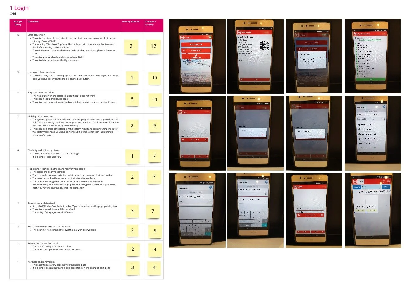
Login User flow
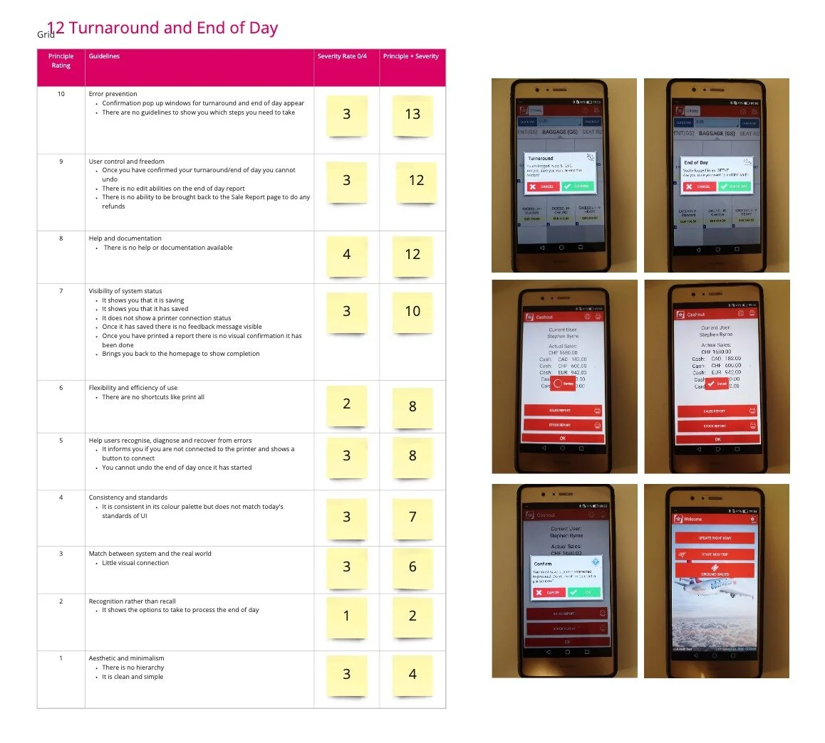
Flight Turnaround User Flow
Sample of Findings
Below are a sample of some of the usability issues found.
Error Prevention
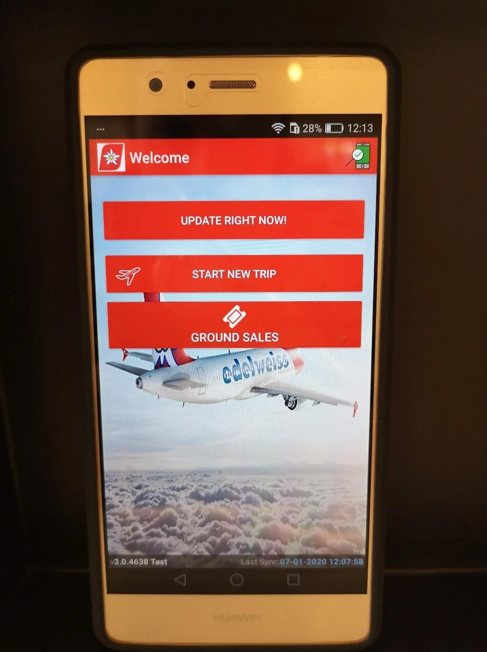
There isn't a visual hierarchy on the login page indicating to the user that they need to “Update Right Now” before clicking "Ground Sales". Updating the device is extremely important to make sure it has the correct stock inventory and prices. It needs to be run before every flight.
The wording "Start New Trip" is also confusing with “Update Right Now” and “Ground Sales” actually being the first set of tasks a user needs to interact with before starting a new trip.
There isn’t any clear feedback to the user when the application was last updated or if it needs to be update.
Visibility of System Status
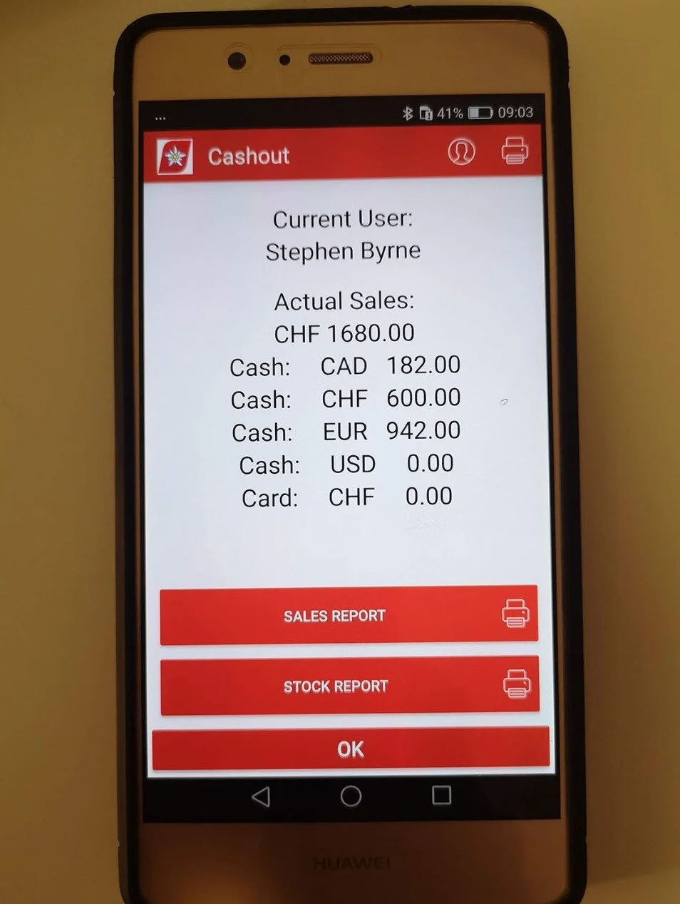
There is a small amount of system status feedback but it does not show the user any external device connection status. The users does not know if their device is currently connected to a Printer or PinPad.
And once you have printed the end of day report there is no visual confirmation that it this task has been completed.
Recognition Rather than Recall
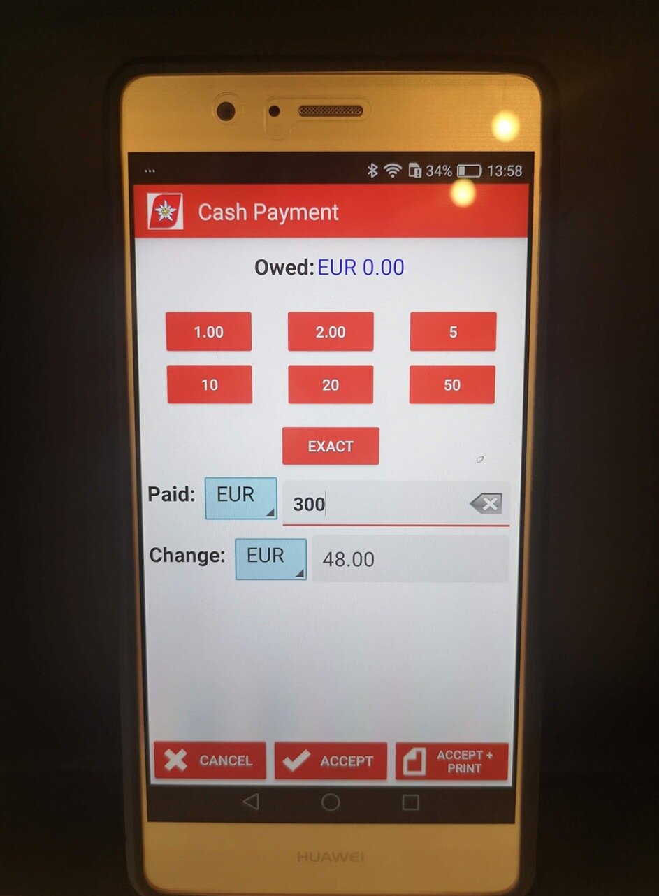
On the Cash Payment window, it does not show the previous split payments that have been charged already. The user has to remember what has already been paid and what payment is still remaining.
Match between system and the real world
The red boxes don't have any visual cues that they represent cash
The app only shows abbreviations for the currencies rather than additional visual information like flags
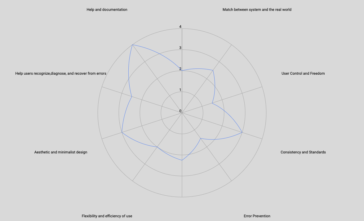
Overview of Results
To quickly illustrate to the team the areas in which the app succeeds and fell short, the findings in each principle were averaged and the results were placed into a Radar Graph. The Heuristic Evaluations findings of the other team members were combined together along with mine to create a Master Heuristic Evaluation document. These results provided key usability starting points for Gate Sales App redesign.