Vector Redesign Project
Vector Onboard Retail Management Platform is the back office engine that runs the Retail inMotion operation. It manages the entire sale lifecycle from new product development to supply chain to sales development and reporting. It is an extremely powerful platform that has grown over the last 10 years. The challenge was now to move this extensive complex legacy product into a modern platform both in the back and front-end. This move was to enable scalability allowing us to build more functionality in future.
The UXUI focus was not only to improve the usability of the platform but to bring our users along with us on this redesign journey. The immense scale of the platform would mean that the migration would take time. We needed their buy in and participation for the rebuild to be successful.
Key focus
Intuitive designs with a modern standardised user interface
Connected and consistent user flows
Unclogged software by removing unused features
Introduce a customer product experience for the users (onboarding, new feature announcements, checklist)


Login and Home Screen
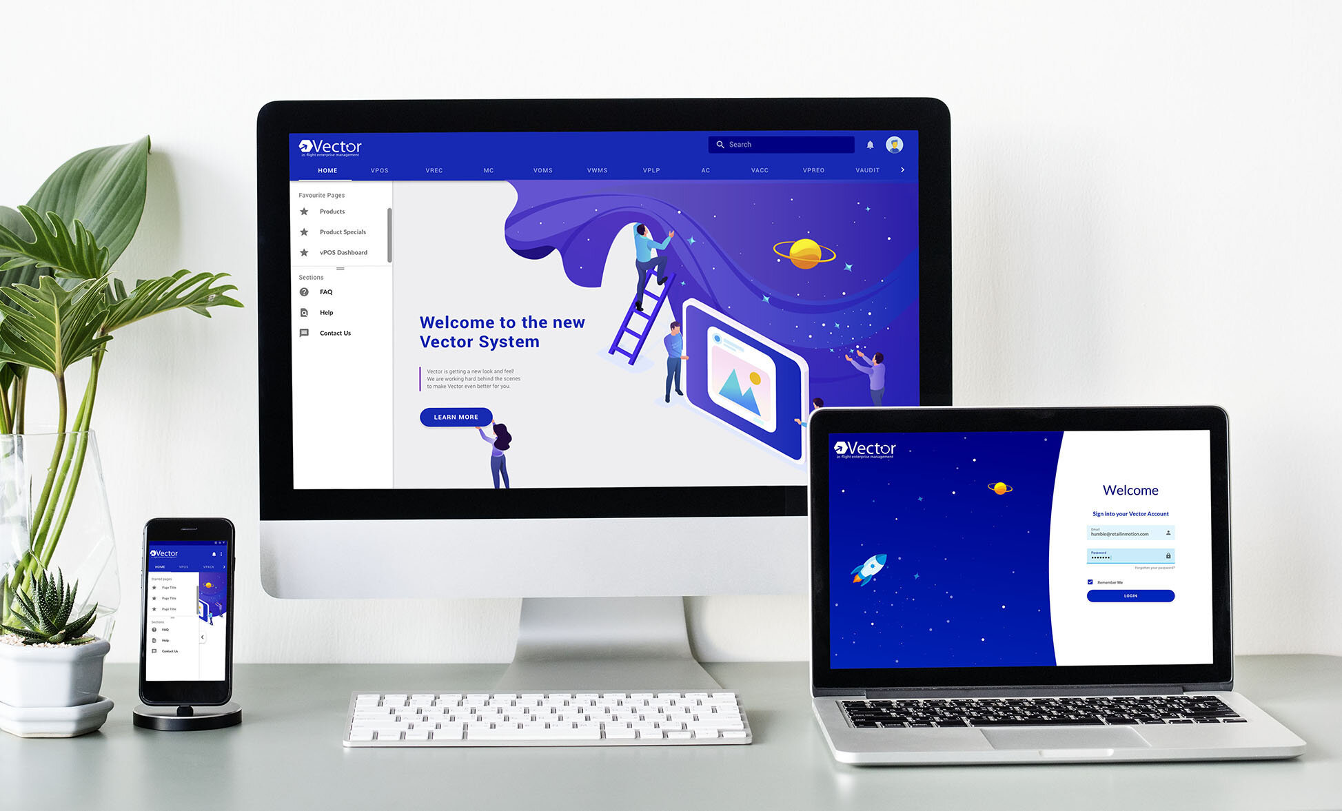
The Login
The new modern login screen I created follows the Retail inMotion brand of “experience travelling anywhere”. This is Vector’s first impressions to our users and it needs to make sure it makes the right one.
The New Home Screen
Vector now has landing page. Previously, users were launched into the first tab and side navigation page on the site. We used this new landing page to bring our users along with us on this redesign migration process. This space can easily be updated, sharing information on new changes and upcoming module launches. To have the buy in from our users we needed to make sure they felt part of the changes and not just a receiver.
The scale of Vector and its functionality gives it a very wide range of users and use cases. I designed a favourite pages section above the sub navigation that allows users to quickly navigate to their most common pages.
The sub navigation menu is now expandable allowing the user to select which sections they want to view rather than see everything and scrolling
The main navigation is now in order of value. Data analysis was used to evaluate on the most visited and valuable areas of Vector and placed them in order of importance.


Error Pages
No-one wants to see an error page but if they have to the least we can do is make them information, actionable and fun. They are now also styled strengthening the new Vector branded.


Currencies
I unified tasks into the one space by bringing currency denominations, airport currencies and currency creating and editing into one task flow
Each currency now has its own full name and relevant flag to help users with recognition rather than recall of just 3 letter currency codes
There is now a currency details page for the users rather than only an editable page to view a currency


Custom Excel Template Creation
I developed a new feature for Vector 3 to solve a problem that was discovered during the research. Throughout every interview there was one feature that all our users spoke about, the bulk upload. This is a feature that allows users to upload a single excel file containing bulk information (example: new products). It is an extremely valuable feature but it had limited functionality. I wanted to expand on the features to allow users to create their own custom excel files for different use cases. To do this, I created a wizard where users could select what type of template they wanted to build and which items and details they wanted to be included. This enabled them to build their own custom excel file, allowing them to edit specific details on a range of specific items.
“If there was a way to download a list of products with prices to edit and then upload it, that would save a lot of time. If this is possible this will really make Vector better then it is now. This will be a big deal for everyone not just me.”


Master Country List
The key change that was implemented on inputing master data like Counties was to give the user a pre-populate list to select from. Previously, users were asked to fill in the country names, codes and continents themselves in a text field. Now users will select from a dropdown menu of countries and once selected the code, continent and now a new flag icon will be populated for them. This creates a single source of truth amongst all our clients and reduces human error. This method will be a standard across all defined core data for the redesign.


Next Steps
The research and design of this project is ongoing as the migration is only on module one out of ten. To be a part of this immense back and front-end complex redesign build is extremely exciting. It provides opportunities for deep dives into large intricate user flows and refactoring features to produce a more user friendly valuable interface for our users.